

In 2019, one of our long-term corporate supporters, Qlik.org, worked with us to develop a dashboard that automatically analyzes the economic and social data we collect from every savings and loans group formed since we launched our Village Investors Program (VIP) in 2014.
Qlik.org is the corporate responsibility arm of Qlik, a leading data analytics software developer that helps enterprises around the world to work smarter and get more value out of data.
Tyler Waterfall, App Developer at Qlik, developed the dashboard alongside our Programs team, and here he gives his thoughts on the importance of using data.
I have seen the power of capturing, analyzing, and reporting on data in the humanitarian space: it provides a unifying foundation on which to base discussion and decision-making. “Seeing the data” can also magnify our sense of global impact when we couple it with personal stories.
When I first talked with the WeSeeHope team, they explained their challenge; whilst they had been collecting in-depth data about the VIP since 2014, they were having to manually analyze and report on it.
Gaining maximum value from data is a process, requiring that we also improve our individual and collective “data literacy”. Defined as “the ability to read, work with, analyze and communicate with data”, data literacy can empower all of us who are involved in humanitarian work “to ask the right questions of data and machines, build knowledge, make decisions, and communicate meaning to others”.
The VIP dashboard matured over time thanks to the continual feedback and input from thoughtful and passionate members of the WeSeeHope team. With a hands-on iterative process, we refined and augmented the dashboard to become both beautiful and insightful for a diverse user group, which includes internal and external executives, team members, and supporters.
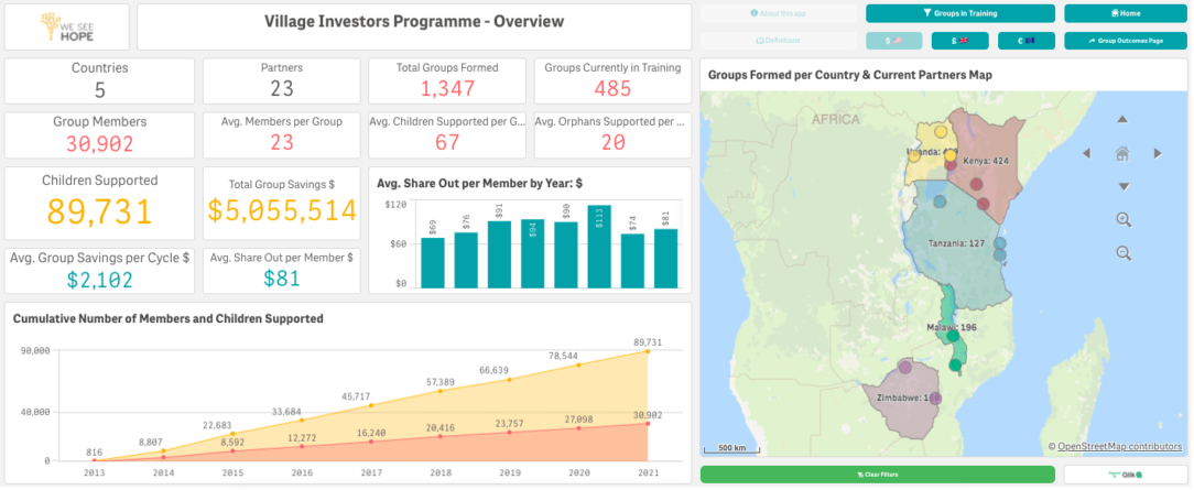
Using all historic financial and social data that they had collected from every VIP group formed, we designed a sophisticated and automated way of showing the scale and growth of the VIP, whilst also demonstrating its impact on members through robust and easily-digestible statistics. This included a country-by-country and partner-by-partner breakdown of the total money saved through the groups and the number of children impacted as a result.
WeSeeHope will benefit from this analysis because it will enable them to:
- Measure and compare the performance of the VIP with their different partners and across the countries in which they work.
- Identify communities or partners which are high-performing or which show warning signs of trouble.
- Assess and potentially communicate the “cost-per-benefit” of the VIP.
- Communicate to the WeSeeHope community about the impact their donations of time and resources are making.
The dashboard was built using our software, Qlik Sense, which provides the ability to bring together distinct data from various sources to visualise, report on, and explore.
In addition to providing the nice graphs we are used to seeing, Qlik Sense’s powerful “Associative Engine” enables users to discover insights in their data which were previously unknown. I personally love Qlik Sense because I can quickly explore new or unfamiliar data and start asking more insightful questions – questions I didn’t know I could ask beforehand.
For WeSeeHope, this has meant that they could ask questions such as, ‘Is there a correlation between an increase in VIP group savings and the percentage of members who are buying animals?’ The answer is yes – as savings increase, so does their ability to purchase financial assets such as goats, cattle and poultry (as shown by the cycle 1 to 3 data below).

Collecting and analyzing data helps organisations like WeSeeHope to balance the biases we bring to important decision-making conversations with quantified measures of performance. With historical data, they can also more easily explain their working model and communicate the effectiveness of their work.
Data quality, efficient tools and processes for auditing and improving data, and clear documentation about both data and analytics, are foundational to creating a usable and trusted analytics dashboard. When all of these elements come together, we experience the highly-satisfying journey of creating analytics to support our efforts to “change our world”.
THANK YOU so much to Tyler and to Qlik.org for all of their efforts to pull the dashboard together!